Arch – Creating the Curve

This quilt design all stemmed from a scrolling session on Facebook. I follow Quilt Fest – Mancuso and found in my feed they had a new quilt design competition for two of their upcoming quilt shows. Mid-Century Mod Modern competition at the Pennsylvania National Quilt Extravaganza and the Pacific International Quilt Festival in California. My first thought was that name seems a little repetitive. But hey, a modern quilt competition that is not put on by the national MQG is rare. So I took a look.
Mid-Century Mod emphasizes the look and feel of mid-20th century design. Artists are asked to draw inspiration from this period, reflecting their own exposures or from the work of artists such as Joan Miro, Piet Mondrian, Victor Vasarely, Frank Stella, etc. Where did you find the inspiration for your Mid-Century Mod quilt?
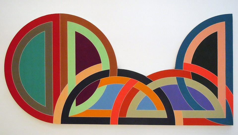
Their description sounded interesting so I used my favorite reseach tool Pinterest to look up some information on their selected artists. Instantly I was in love with the work by Frank Stella. Curves galore!
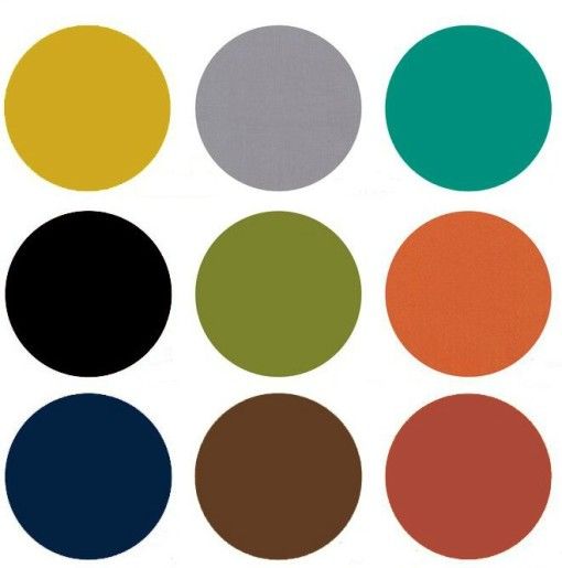
Using his piece as a starting point, I turned to my good friend Pinterest again to help choose the color scheme. I wanted a color scheme true to the time period that would show a good range of values.
First Up – Designing the Quilt
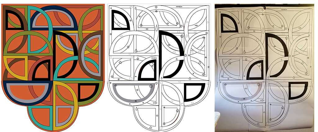
As a trained computer graphic artist, I decided to use Photoshop to design the quilt. I was able to create a vector shape of the half circle and quickly change colors and duplicate. Layering the shapes around is fun and added in a few quarter arches to break up the pieces. I liked the double layering of arches to have multiple sizes as well. Looking back at Frank Stella’s work, I wanted to create an overlap but not the exact same idea. I liked his use of multiple different colors in the background but for me, orange is the way to go. It’s my favorite color to use in a quilt and would work perfect as the backing here. The color itself was a mid-range in the values so all the other curves would work off it. When I first saw Frank Stella’s pieces, instantly I knew I wanted the bottom of the quilt to incorporate the arch. Keeping it a square would not do with these pieces and made for an interesting design challenge.
Once I had the layout for the quilt, I created a black and white version with a color code system, so I wouldn’t waste a lot of ink in creating my layout. I was going to print on regular size paper first, but ended up sending the images to Office Depot to be printed on architecture paper sheets. It was much easier to work actual size and tape them together. Then I used a light box to draw the shapes onto fabric, to create the arches.
And then the very important questions, how do you actually sew it?
It’s not a drunkards path. The angles are different and all of the overlapping would require tons of planning to do it. I thought of the Sharon Schamber Piece-lique method of sewing curves. It could work, but again tons of planning and I didn’t necessarily have all that time before the first deadline. I decided to make it with applique. It was the simplest method to get my effect, but I would soon realize not as simple as I thought.
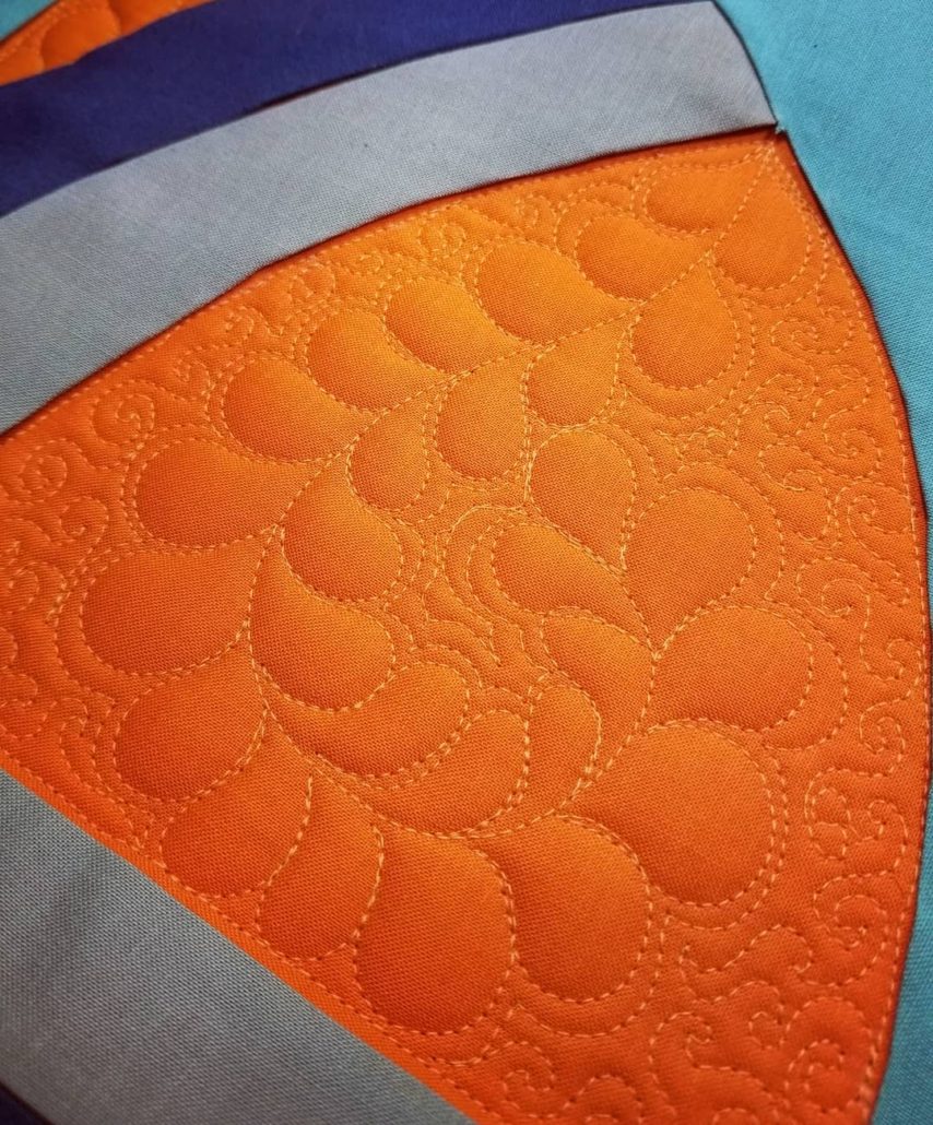 This wasn’t hard to create, but I definitely had to pay attention in what I was doing. I was dealing with bias edges so careful to not overstretch. Like needle turned applique, I ironed each side of the arches to create a nice edge. I was contemplating sewing the pieces down on the orange first, with my domestic machine. I wanted the edges to puff when quilting so each arch was glue basted until the quilting stage. That was a mistake. I had a double batting for my great texture, but it was very difficult to keep the lines clean as I quilted them. It puffed just like I wanted it to, but the stitching was uneven. Lesson learned for next time!
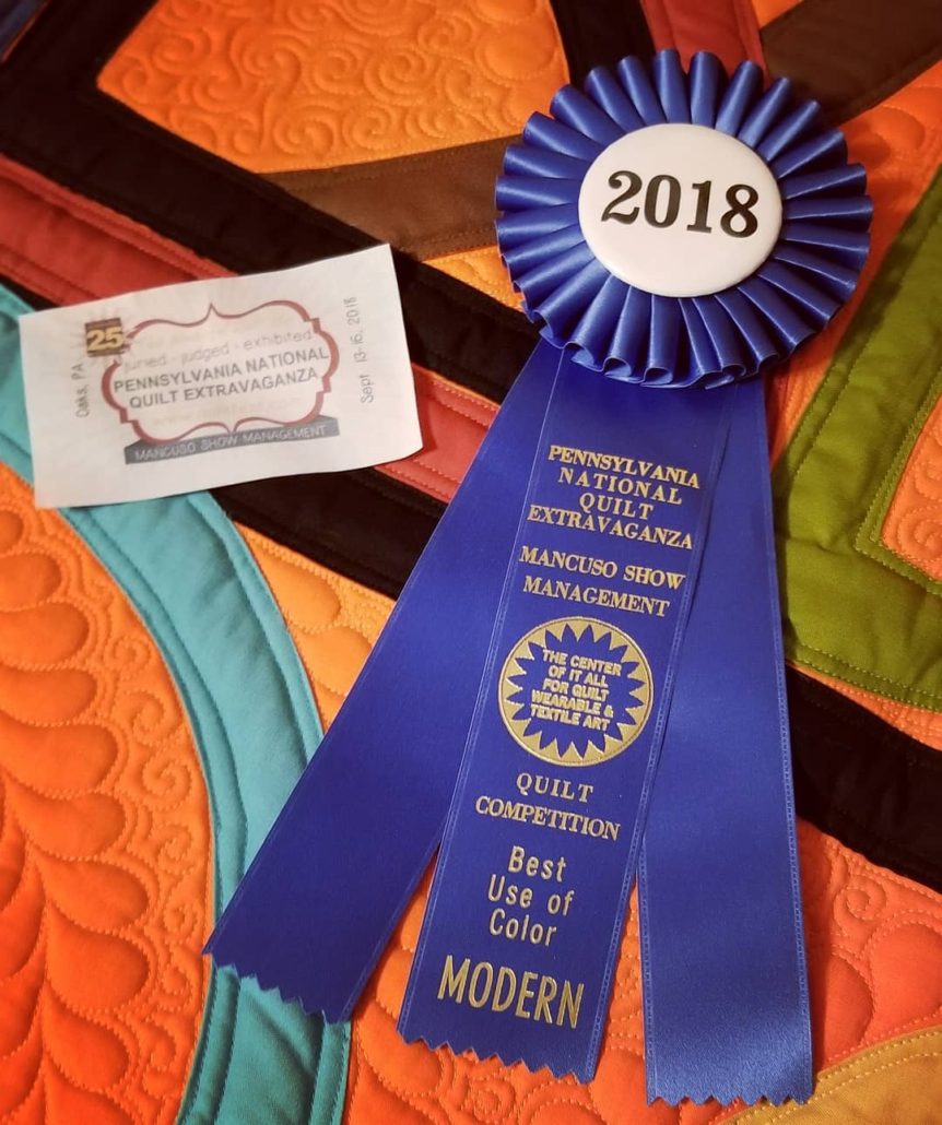
Sending it off to the contest I could see the flaws. I know you are not supposed to point out what’s wrong in a quilt, but I knew it was a Blue Ribbon winner. The quilt overall looked exactly the way I had hoped, minus the stitching on the curves. I still had high hopes for it be accepted, but probably not win anything. Well, I was wrong! The quilt was accepted and won Best Use of Color for the Mid-Century Mod Modern competition at the Pennsylvania National Quilt Extravaganza! Even the judges mentioned the uneven stitching – lol. Knowing all the issues I had with this quilt, the stitch technique errors I could see – I was completely surprised to win this! It goes to show how research can benefit in quilt design.
And to my surprise when the quilt came home, the ribbon was blue.